Tuesday, 13 May 2014
Monday, 12 May 2014
TOO MANY KNITS
I made and ISSUU BOOK containing arrangements of my favourite knitted images. I think it's nice to see them in a 2d setting and almost helps towards seeing what they look like displayed next to each other. So far I've only been grouping them according to location however for the final show I would like to display all of them together.
 |
| My favourite knits |
Sunday, 11 May 2014
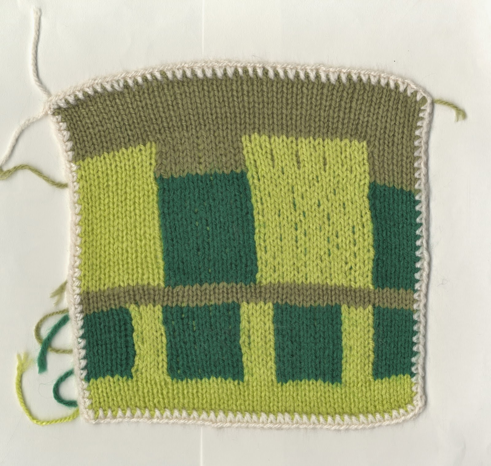
BOURNEMOUTH KNITS

My finished Bournemouth knits. I originally wanted a layout similar to that of the landscape images. However I was unhappy with 5 of my knitted images and so chose to leave them out. This left me with the right amount to do a 4x4 grid which I think works well.
Saturday, 10 May 2014
SELF-PROMOTION
My business cards arrived during the week meaning I've had time to think about self-promotional send outs. I figured it's best to keep it simple and so made origami envelopes in which I put a postcard with my email on the back, a business card and small badge with my logo. I've also made small packages that could be given away in person. Smaller origami envelopes with my website on the back, containing just a badge. I hope by using my digital work to create the envelopes that they'll be eye catching in a pile of normal mail, and therefore more likely to get picked up.
 |
| finished business cards |
 |
| send-outs. Origami envelope, business card, postcard and badges. |
 |
| smaller origami envelopes and badge send outs. |
Thursday, 8 May 2014
FINISHING UP THE PORTFOLIO
I had good feedback about using black as a backing for my knitted images, they looked more like stand alone objects. Having the white background made the entire sheet seem like the image. I had used mount board covered in black paper to get the black background, but didn't like the way it sat in the portfolio. I went on the hunt and eventually found black mount board that was fully black, edges and all at Hobbycraft.
I decided to put some of my digital work in as well to show the process of making, these I've mounted on normal mount board just so all the pieces feels the same.
 |
| My final portfolio |
I decided to put some of my digital work in as well to show the process of making, these I've mounted on normal mount board just so all the pieces feels the same.
Wednesday, 7 May 2014
FULL 360
With only one week to go it's interesting looking back at my original synopsis of study, and revised synopsis. I feel over the last few months my work has come full 360. From wanting to look at scenic areas and recreate these in knit, to looking at brutalist buildings to then scrap knit altogether. I've come back round to the process of knit using the drawn and digital work as development and supporting work, and creating final knitted images. Now that I'm end the end of the project I can look back at what my aims were for a final outcome. In my synopsis of study I stated that:
"In terms of having a final outcome, I don't want to envisage this project as having a definitive end, I will therefore be working towards a series of images and sculptures that work well supporting one another with have the prospect of continuing indefinitely."
Although I decided against pursuing 3D knits due the the amount of time they take I do have a series of knitted images that work on their own or as a collective. I also don't see the project as being over. Due to the source material it has the potential to continue indefinitely in terms of creating more knitted images, developing existing knits into 3D or creating more drawn imagery around the subject and responding to them.
I've also looked at both natural and man-made landscapes. I originally wanted to focus on the natural landscape and look at the man-made if there was time. However by pursuing them both I became responsive to the variation between the natural and man-man landscape. The differences in feel, composition and colour. This led me to focus on each separate for a period of time and then finally bring this work together in later work surrounding bournemouth by looking at areas combining man-made and natural, whilst again focussing on arrangement of buildings within a more natural environment and limited colours.
Tuesday, 6 May 2014
KNITTING BOURNEMOUTH
I used the long weekend to create more knits based on my images of bournemouth. I think these are my favourite set of knits so far as I feel they represent a balance between natural and man-made landscapes.

Monday, 5 May 2014
PORTFOLIO MODIFICATION
I've found it difficult finding the right card to mount my work on within my portfolio. I decided on thin mount board as this looked best but still can't get over the fact it's mount board and hate the look of the edges. I decided to try covering the mount board to make it look more 'done'. I decided on black paper as I felt this meant the background would blend into the portfolio box making the mounted images stand out.


I thought I would like the black more due to the contrast with the paper and the crochet edge. As I chose off-white to finish the edges I wash;t sure about how I felt it sat on the white paper. I assumed black paper would make it stand out. However now seeing them in the box I'm not sure which one I prefer, I think the black looks sleek and seamless whereas the white seems more traditional. I think when in the box the colours of the knit are more vibrant when mounted on black however side-by-side the white appears more eye-catching.
I thought I would like the black more due to the contrast with the paper and the crochet edge. As I chose off-white to finish the edges I wash;t sure about how I felt it sat on the white paper. I assumed black paper would make it stand out. However now seeing them in the box I'm not sure which one I prefer, I think the black looks sleek and seamless whereas the white seems more traditional. I think when in the box the colours of the knit are more vibrant when mounted on black however side-by-side the white appears more eye-catching.
Saturday, 3 May 2014
GETTING PRINTED PROPER
Now that I have a domain name www.crystalbudd.com I think it's important to get my business cards printed properly. I used moo.com as you can upload as many designs as you want, can preview the cards before you get them printed and can also have rounded edges.
 |
| My final business card designs |
Friday, 2 May 2014
WEBSITE
I've enjoyed making my website but now appreciate how difficult it is to get things just as you want them. I toyed around with various means of navigation. Having a home page with buttons that take you to the relevant page. Having a hand-rendered title and navigation bar, whilst also modifying my logo and the arrangement of projects.
 |
| I originally wanted hand-rendered text for my title and navigation bar. However I found my writing didn't really translate to this very well and it looked messy. I picked a semi-cursive text instead to resemble my style of writing but in a much cleaner manner. I then imposed my knitted texture to make it more interesting. |
 |
| I changed the navigation bar from the side of the screen to the top. I also changed the colour and type to match the header all using the css. |
 |
| I changed my logo from a square format to circular. I feel this made it feel less awkwardly placed and also meant it translated better to other areas. |
 |
| Screen-shot of the final layout for the intro to my website. |
 |
| I also changed the project pages. I made the emphasis on the knitted items, with just one image set relating to other media. I removed all the extras around the slideshow, making the pages clean and bright so there's nothing to distract from the image on screen. |
Thursday, 1 May 2014
PORTFOLIO REVIEW
I had a portfolio review today with Gina Cross. My physical portfolio wasn't really touched upon, the main comments made were towards my tumblr. To add more writing as this is the blog I promote for others to see. More writing about the work will mean people have a better idea of what I'm creating and why I choose to work this way.
Wednesday, 30 April 2014
MAKING WAY WITH THE PORTFOLIO
With the build up to my portfolio review tomorrow I've been selecting my favourite knitted pieces to create on larger scale to put in my portfolio. I think it's good to have the real thing with knitting and it was mentioned I should incorporate original woks. I've also included the bournemouth pier knit unmounted so that it can be handled.


These are the images I've chosen to knit so far. I'm toying with the idea of including images in my portfolio as I want to include the laptop.

Tuesday, 29 April 2014
SELF-PROMOTION
To get an idea of how to present myself I had some mock business cards and postcards made. I like the look of the postcards and feel the cropped images work here. However my business cards are dark and boring. I think it would have been better to have created them in the same way as the postcards and used cropped images. I do like my logo though and feel it ties all the work together, both in terms of promotional and online material.


Monday, 28 April 2014
BACK TO BLOCK
After trying to translate the bournemouth images to knit, I've decided to revert back to the original method of block drawing as I think this translates better to knit. I've gone back over my previous bournemouth drawings and pictures and used coloured pencil to recreate them for knit.


KNITTING IN DETAIL
I attempted to knit some of my bournemouth line drawings. I quite like the linear quality of the second image but feel the first hasn't translated as well. This could be to do with the use of 3 shades rather than 2.


I decided to knit a more complicated 2 colour image. I chose an image of the pier previously drawn for the mayor's wine competition. I don't feel this has worked as well as the block colour pieces as too much detail is lost during translation to knit. This image is of Bournemouth pier, however this isn't initially apparent. I think once the viewer is aware of the content it's more visible but I still think it's a lot weaker than previous work.

Tuesday, 22 April 2014
PHOTOGRAPHING MY WORK
I booked the camera equipment out over easter weekend to play around with composition and to see how my work photographed. However after getting the equipment home I found out one of the lights didn't work. The images therefore weren't as bright as I'd have liked, but nothing a bit of photoshop couldn't fix. I ended up whiting out the backgrounds but I'm glad I photographed it for the shadows.
 |
| I started off with more of a random arrangement of all 10 |
 |
| I thought it might be nice to group them by colour (browns, greens, blues, orange). I didn't like the triangle that formed. Wanted more uniformity |
 |
| really liked the 3x3 arrangement, although I had to leave 1 out thought it looked a lot better. |
 |
| Tried the 3x3 with the landscape imagery, however didn't feel right. |
 |
| Tried in 5x2, liked this a lot more, as it's wire than it is tall feel it better represents the landscapes as a lot of the colours within are blocked this way. Didn't like the position of the black, blue and green image (top right) |
 |
| Prefer the image with black in at the bottom. It's the only patch with black in and also seems a lot harsher than the rest. I think the position it's in now is better as we look from left to right it almost acts as a full stop. |
Final Images
 |
| I decided to change the centre image as I thought it was too bright in comparison to the others. Although it could've acted as a focal point I thought overall it would be too distracting from the rest of the images. |
 |
| for both images I used photoshop to change the levels, making the whites, whiter. I also re-took the the images after tidying up the stray wool strands as I thought this looked more finished and professional. |
Monday, 21 April 2014
PICTOGRAM MARKET
 |
| My stall at pictogram's market event at 60 million postcards |
Sunday, 20 April 2014
DRAWING BOURNEMOUTH
While continuing to knit from my previous imagery I continued to draw from scenes around bournemouth. Knitting for too long is quite painful and I get finger cramp so having drawing breaks allows me to knit all day. The drawings aren't anything like my previous coloured pencil drawings as their purpose is different. Their quick line drawings more aimed at helping me experiment with composition than intended to be knitted.


Monday, 14 April 2014
PORTFOLIO REVIEW
I found the portfolio review extremely useful. Not only in talking about the display of my own work but hearing how others planned to do theirs also helped inspire ideas for mine. In terms of my website it was suggested that both the front and back of the images be shown. For example you have the front of the knitted piece and you hover/ click on the image and it changes to the back. The back of my pieces are just as interesting as the front if not more so as they allow you to see how it was made (with the intertwining of yarn), I would not have thought to include this digitally and so this suggestion will add a lot to the overall feel of my website.
For a hard portfolio it was suggested that I use a box portfolio and mount the knitted pieces on nice card. Although I like this idea I also feel I need something else to go with it as this takes out the full tactile nature of the pieces. I therefore would also like to create a separate box in which I have either 1 folded large piece or a selection of small knitted patches (possibly A5 as I could use existing work) which would allow people to directly handle the work. This could also be displayed in a similar way to a textile sample book with the small patches being bound together at the edges (via crochet) to make a knitted book.
For a hard portfolio it was suggested that I use a box portfolio and mount the knitted pieces on nice card. Although I like this idea I also feel I need something else to go with it as this takes out the full tactile nature of the pieces. I therefore would also like to create a separate box in which I have either 1 folded large piece or a selection of small knitted patches (possibly A5 as I could use existing work) which would allow people to directly handle the work. This could also be displayed in a similar way to a textile sample book with the small patches being bound together at the edges (via crochet) to make a knitted book.
Sunday, 13 April 2014
WELCOME BACK KNIT
To get my hand back into knitting I took the weekend to select my favourite images relating to urban landscapes and translate these into knit. I'm happy to be knitting again as I feel my knitted work got a very good response at the craft exhibition. As there's not much time left I want to get as much done as possible which means I've scaled down my work to knit squares of approximately 10x10cm. I've decided to choose 10 images from both the drawings relating to buildings and 10 from those relating to landscapes. These hopefully will work on their own digitally but also can be arranged together into a larger piece of work for first hand exhibitions.
The issue I'm experiencing now is how to display them. Wether to display them with all the working strands of wool hanging freely (similar to in the above picture), or neaten the up and display them as in the craft exhibition.
 |
| A selection of the pieces made over the weekend |
Thursday, 10 April 2014
GROUP TUTORIAL
Overall the feedback from this tutorial was positive. I was worried about the combination of knit and digital work within my work, and how far my work has come from my initial knit work. However it was mentioned that the transition from hand-made work to digital was coherent and obvious. It was also mentioned that I should have a combination of knitted, drawn and digital work on my website. I'm particularly happy about this bit of feedback as at the moment I feel my website is too clinical. With the digital and drawn work only it looks very clean but boring:
I now feel I can make it more fun and appealing by putting the emphasis on the knitted work and using the drawn and digital work as what it is- supporting work.
 |
| screen shot of my opening page |
I now feel I can make it more fun and appealing by putting the emphasis on the knitted work and using the drawn and digital work as what it is- supporting work.
MAKING SOMETHING FINISHED
I'm feeling quite tired of working in this simplistic manner and want to revert back to the earlier brutalist style of drawing. Simple angular images. I do however want to stick to my use of colour, although I'm undecided wether to use pencil colours and edit them digitally for the texture or to stick to the block colour technique. To feel a little bit more finished with the work I have so far, I've made small issuu books containing my favourite images from each area of work, the original work from London and Oxford, works based on building interiors and landscapes, and natural landscapes.
ISSUU BOOKS
Although I've done this I still feel they need refining, for example only having one image per page as I don't feel like some of the images sit right next to each other and also having far fewer images, maybe only 6 for each area. However I do want to have a proper book printed of all the images, more for myself as a momento of my final year work.
Saturday, 5 April 2014
CRAFT EXHIBITION

I decided to put knitted work into the craft exhibition. The laptop from my pre-major and a combination of 2D knitted pieces from my major and pre-major. This meant I didn't have to create any new work just make old work presentable (I had to crochet edge all the 2D work and fix the laptop so it stayed open).


Setting up took a lot longer than expected, it took us the whole day. It was interesting to see how long it actually takes to set up an exhibition. From arranging where everything will go to making sure it's all at the right height.

Everything went perfectly on the night, it was packed inside and out. Live music and alcohol was definitely a winner!


On a side note
Some label stickers I printed my details on to give out at the exhibition:


Subscribe to:
Comments (Atom)