Monday, 31 March 2014
TALK WITH PAUL
I was feeling a bit uneasy about where I currently am in my work and what I want to spend the last month doing. My plan was to create a small series of books combining the work I have so far as a concluding of what I've been doing and then go on to make images of the bournemouth I enjoy to again make into a small book or series of images. I had a chat with Paul and he liked the idea of the small books but said it was important to group things accordingly. For example I showed him the grouping for my website and he said it didn't work grouping things by media and instead to group by theme. I've therefore decided to group by interior and exterior. I think this pretty much sums up what I've been doing and splits the work nicely. He also said that as for taking the work further it could be interesting to focus on the juxtaposition of combining my digital style with the brutalist sketchbook style, and translate this to imagery on Bournemouth. Look at why people come to Bournemouth, but why I like Bournemouth. He also suggested I watch Jonathan Meade's Brutalism programme on B.O.B. It's in 2 parts. I've watched the first part but I'm not sure how relevant it is to me anymore. I did like some of the descriptions of Brutalism though such as 'concrete monstrosity' and 'practical utopia'.
Sunday, 30 March 2014
DRAWING FRENZY
I've spent the last week doing a combination of observational drawing and drawing from pictures taken of places visited . To begin with I was continuing to draw buildings and man made scenes around Bournemouth and Boscombe. While I was doing this work it was suggested to me to use my method of drawing the exaggerated perspectives to draw natural landscapes. I therefore turned my hand to drawing, beaches, fields, farmland etc and revisited my pictures from jersey to create angular flat colour landscapes.


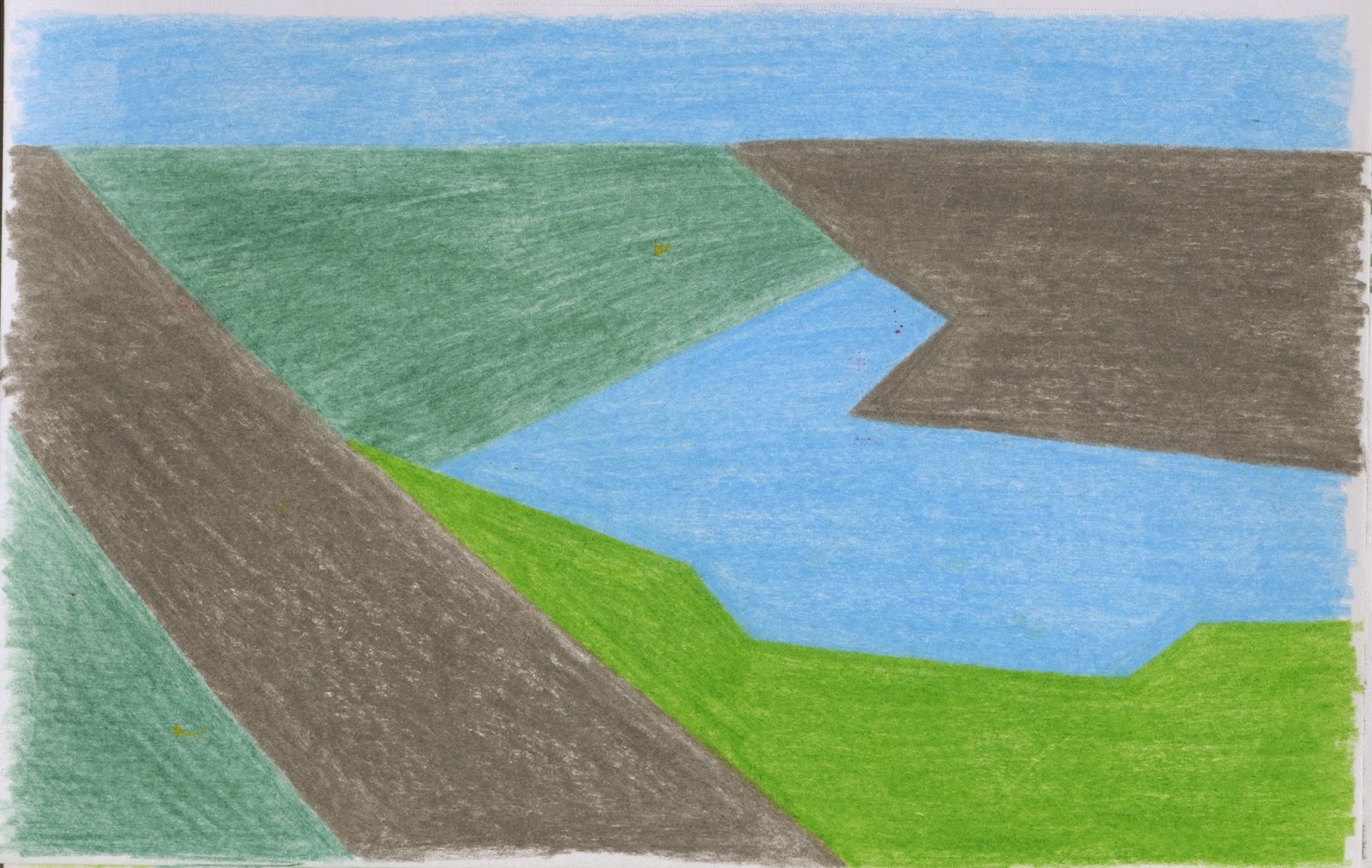
Initially I wasn't sure how well this way of working would translate to natural environments due to it's sharpness. However I think it's worked just as well as drawing built up areas. This revelation now means I can broaden my subject matter, without worrying too much about the way it's created. I was worried the city landscapes were becoming a bit samey, so being able to look at natural sources of inspiration while keeping with the blocky style brings a new element to my work whilst keeping continuity of style.
Saturday, 22 March 2014
REVISED SYNOPSIS OF STUDY
Considering I haven't touched a knitting needle since it was suggested I focus more on my drawings and there's only a month to go. I think I need to reassess my synopsis of study. Originally I was aiming to produce a series of knitted sculptures and images in response to an area. Therefore incorporating both 2D and 3D work. This then developed into the idea of creating brutalist themed buildings. However as it's been suggested on more than one occasion I push my drawings I've spent the last month working entirely 2d with pencils, coloured pencils, watercolour and occasionally developing these images into flattened digital images. As for the craft exhibition: I made it with my hands is now coming up. I feel I can step back from this need to incorporate 3D into my major project, as I shall be including knitted works in this exhibition. I can therefore focus entirely on the 2D and perhaps look into the suggestion of incorporating knit into my 2D works (although I doubt I'll go back to knit at all). I believe working in this way will also benefit my portfolio. As it shall be 2d and predominantly drawn it should translate well to photograph or scan. I am now involved in a craft exhibition and have a stall at Pictogram's market event to look forward to. Hopefully these side projects, with their emphasis on craft and hand-made shall keep me busy and not missing knitting for the remainder of the project.
Throughout the remainder of this project I shall be further investigating landscape, buildings and texture through drawn images. However instead of looking purely at built up areas I shall also be looking at areas with more of a rural feel and natural appeal. Looking into farmland and cottages for the Cath kidston brief has made me want to look more at more non-urban areas. I have taken huge inspiration from the detail and texture of Nigel Peake and Mister Mourao, the construction of brutalist buildings and the composition of Thomas Demand. I hope to keep in mind the elements of influence they have given to my work while continuing to create imagery. I feel I have a lot to work with so far, from London, Oxford, Jersey and Bournemouth, and shall continue to create new imagery from observation by looking into bournemouth's farmlands, rivers, beaches etc. Hopefully another 2 weeks or so of working in this manner will give me enough to look back on to create a large final image, as I would like to display an A2 or A1 size original drawing for the final degree show.
Throughout the remainder of this project I shall be further investigating landscape, buildings and texture through drawn images. However instead of looking purely at built up areas I shall also be looking at areas with more of a rural feel and natural appeal. Looking into farmland and cottages for the Cath kidston brief has made me want to look more at more non-urban areas. I have taken huge inspiration from the detail and texture of Nigel Peake and Mister Mourao, the construction of brutalist buildings and the composition of Thomas Demand. I hope to keep in mind the elements of influence they have given to my work while continuing to create imagery. I feel I have a lot to work with so far, from London, Oxford, Jersey and Bournemouth, and shall continue to create new imagery from observation by looking into bournemouth's farmlands, rivers, beaches etc. Hopefully another 2 weeks or so of working in this manner will give me enough to look back on to create a large final image, as I would like to display an A2 or A1 size original drawing for the final degree show.
Thursday, 20 March 2014
CROWD BRIEF AND MAYOR'S CHOICE WINE
Both these briefs were pretty straight forward. The Crowd brief invalid making imagery based around the subject of Dubai or business icons, for a company called oryx. It didn't state wether the imagery should be black and white but the example they;d given of what had been done previously was made up of all black and white images. With both of these briefs I wanted them to be quick, drawn and edited in one day. Just to see the kind of work I could produce when working to a tight deadline. For the Crowd brief I used these 2 images as the basis for my finals.
 |
| This image draws focus to the Burj Khalifa |
 |
| This image is a more generic depiction of the Dubai cityscape. |
These are my final images. Although the second image is more detailed and took more time the first image is my favourite. I feel by having such a minimal approach to the city the entire emphasis is on the Burj Khalifa. I also think this image is more compositionally successful.


These are my submissions for the Major's wine competition. I approached this in a similar way to the Cath Kidston competition as I knew colour was allowed to be used. I painted the components separately then brought them into photoshop to create whole images. I had to flatten a lot of the colour as the designs are for a label and so need to be quite bold.


I definitely wouldn't say these were the best images, I'm not sure how much I even like them. However I entered them anyway just in case. The other entries are very graphic and generic so hopefully my more playful looking designs will get some positive attention.
Monday, 17 March 2014
CATH KIDSTON COMPETITION
 |
| original pattern attempts |
After attempting to translate my images for the Cath Kidston brief into a pattern, I found my approach just wasn't working. It didn't fit into their original patterns (one of the specification was that the pattern mustn't look out of place among their collection).
I realised their images are made up of flat colour yet still had a watercolour feel to them. I therefore used my lightbox to recreate my original drawings in watercolour, sticking to a limited colour palette.
These were then put into photoshop and the colours flattened.
 |
| chosen components worked into a hexagonal arrangement |
It was amazing to see how much more my work suited the brief when altered in this way. Once I had the elements I wanted to use I chose to arrange them into a hexagon as I knew this shape would tesselate to create the pattern and it also kept me aways from a boring checked pattern. It was mentioned to me before that patterns are much more interesting when it's hard to tell where the pattern starts, I think the hexagon works much better for this than a square format.
 |
| finals for cottage pattern |
 |
| finals for farm pattern |
 |
| offset patterns |
Tuesday, 11 March 2014
BRITISH COUNTRYSIDE
The harsh graphicness of my previous pattern in approach to the Cath Kidston Brief didn't feel right, so I've gone back to the drawing board, sketching elements I would like to see combined for my pattern. This includes a lot of building work but unlike my major-project, the focus is on cottages and houses with a country feel rather than built up city buildings.


I really enjoy working in this loose manner using coloured pencils. Although the angles and perspective is very off in places, you still understand the image and the un-perfect line work gives the images a sense of playfulness that I think will be needed in the pattern.
Sunday, 9 March 2014
CATH KIDSTON BRIEF

I'm taking a bait of time out from my work to look into competitions. The Cath Kidston brief appeals to me as it's simply to create a new pattern. However the brief is very specific in terms of what is wanted. I played around with the idea of patchwork using samples of my window work to create this pattern. I don't think it looks like a Cath Kidston piece, and the brief was very specific in saying that the pattern should fit in with the original conversational pieces. Examples of the conversational prints include:
London Scene

Cowboy

Safari

Looking through the Cath Kidston website I noticed a few areas not covered within their prints; the sea, camping, houses and farmland. The brief asks for a print that is nostalgic and depicts british humour among other things. I've therefore decided to create a pattern based on the british countryside. Looking at cottage like houses and farmland alike. This will allow me to use previous research from Jersey and more first-hand research using my local area as bournemouth has a small area dedicated to farmland.
Saturday, 8 March 2014
EXAGGERATED PERSPECTIVE
Continuing my work looking at built up landscapes, I have been attempting to create an archive of images created with the exaggerated perspectives of Demand in mind. I have chosen to use coloured pencil in an attempt to convey depth, yet stuck to a selective colour range so as to not be distracting. I have left them without detail as with this work I am trying to get a better sense of perspective and composition of a page.


Thursday, 6 March 2014
PAPER PAPER
The paper collaboration is now finished, with the Issuu book having been published and a small animation made.


Wednesday, 5 March 2014
MARK MAKING
After looking through Nigel Peake's in the wild I was inspired to look at the quality of my line and the marks I can achieve. I started by looking at pencils and the different texture each one gives. Although this is pretty basic, I'm happy I did this as before now I tended to work purely with H's unless I needed a really dark line in which case I'd go straight for 6B. This has just proven to me how much texture I'm missing out on by not varying my use of pencil.

Next I wanted to see the texture I could creature using single directional line and then how adding subsequent lines changes the appeal.

 |
| At the time I was really happy with my decision to create trees in this way |
Evening Doodles
 |
| Using the same approach as my patchwork building I created a block of patchwork textures. |

Tuesday, 4 March 2014
NIGEL PEAKE
After the tutorial I went to the library to have a look for books on the artists mentioned. I got out Nigel Peake's In the Wilds and couldn't put it down. It's such a brilliant book, his approach to textures, in both man-made and natural objects. The sheer quantity of marks and line work would make you think his work should look too busy, but his clever colouring means nothing seems too much or out of place. There is also a very playful quality to his lines as it doesn't appear he uses a ruler. It also looks like a lot of his lines are created using a brush.


Images from In the Wilds
 |
| Front Cover |
Monday, 3 March 2014
TUTORIAL
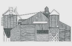
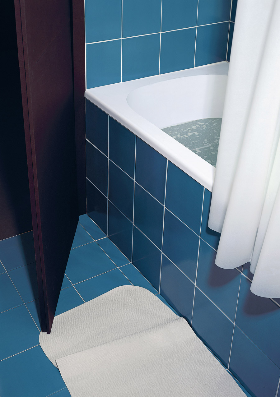
I had a tutorial with Marcus and Joel and overall the feedback given was good. My drawings were praised especially initial patchwork building image (which had just been a doodle to get my drawing flowing), they particularly liked the quality of the line as here unlike in all the other pieces I hadn't used a ruler. I was given various names to look at such as:
 |
| Hundertwasser House |
 |
| Making Ends Meet |
 |
| Bathroom |
BRUTALIST BUILDINGS
I've spent the last day purely drawing buildings, both interiors and exteriors. Over the few days I noticed that the key to a good composition was exaggerated perspective. I feel my images created in this way are more successful. It gives an angular feel to the pieces which I feel fits in more within the realm of Brutalism.


 |
| example of earlier, minimalist landscape |
 |
| furthering the blocky look of the buildings |
 |
| example of interior |
 |
| later work focussing of exaggerated perspective |
Subscribe to:
Comments (Atom)